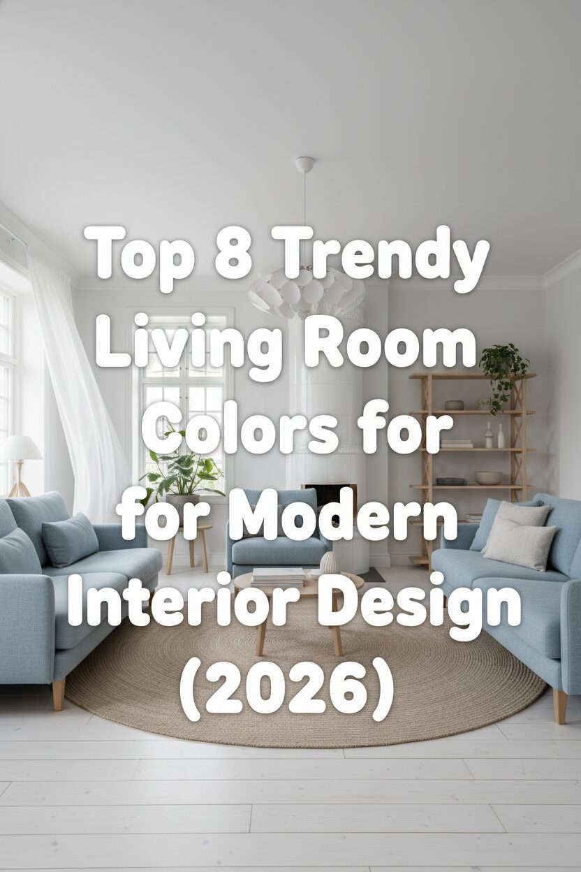
Scandinavian interior design continues to evolve by blending traditional minimalism with a contemporary palette that emphasizes warmth and natural connectivity. As we look toward the year twenty twenty six the focus shifts toward a sophisticated selection of colors that redefine modern living spaces through light and texture. These hues are meticulously chosen to enhance the architectural integrity of a room while fostering a serene atmosphere that invites relaxation. From the subtle nuances of chalky whites to the deep grounding presence of forest tones each color serves a specific purpose in creating a functional yet aesthetically pleasing environment for every modern homeowner.
Alabaster White for Light Optimization
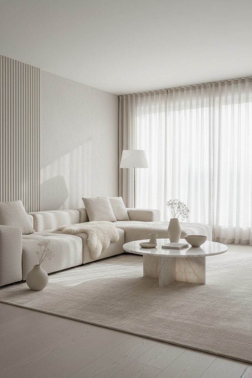
Alabaster white remains the cornerstone of Scandinavian design because it maximizes the natural light filtering through large floor to ceiling windows. This specific shade provides a soft matte finish that avoids the sterile feel of pure white while highlighting the clean lines of minimalist furniture. By reflecting sunlight across the room it creates an airy atmosphere that makes even small spaces feel expansive and open. Architects often pair this hue with light oak flooring to establish a seamless transition between the walls and the ground. This color choice serves as a perfect canvas for the intricate shadows cast by structural ceiling beams.
Nordic Slate Gray for Anchored Depth
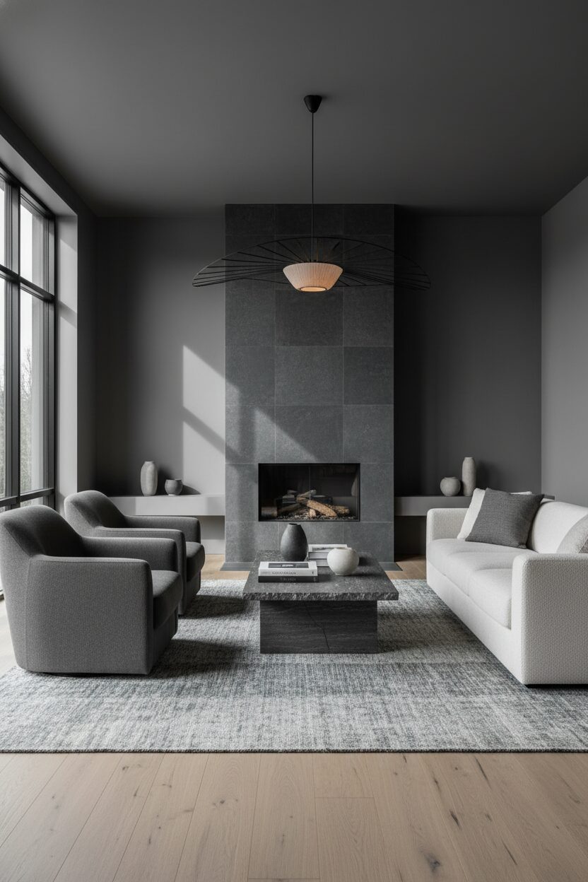
Nordic slate gray introduces a necessary depth to the living room by grounding the ethereal qualities of lighter elements. This sophisticated mid tone works exceptionally well on accent walls or upholstered seating like modular sofas. It mimics the rugged coastline of the north and brings a sense of permanence to the interior layout. When combined with brushed metal light fixtures or industrial steel frames the color takes on a modern edge that defines specific zones within an open floor plan. Designers utilize this versatile shade to balance the visual weight of the room and ensure that the composition feels anchored.
Soft Sage Green for Biophilic Harmony
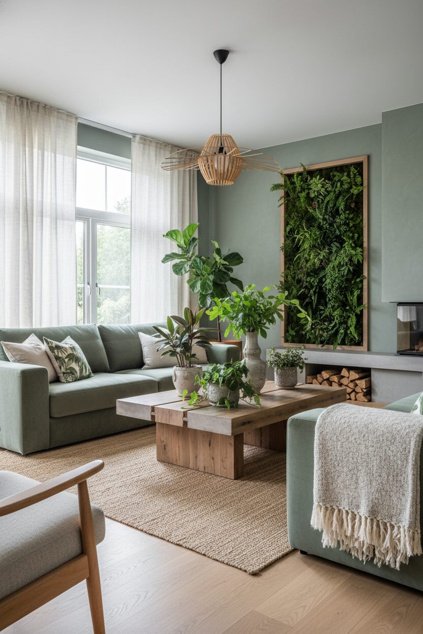
Soft sage green bridges the gap between the indoors and the natural world which is a fundamental principle of Scandinavian living. This organic hue evokes the tranquility of a forest clearing and promotes mental well being through its calming properties. It is often applied to textured surfaces such as linen curtains or woven wool rugs to enhance its tactile appeal. The color interacts beautifully with indoor greenery and botanical arrangements creating a cohesive visual narrative. In twenty twenty six we see this shade paired with light colored timbers and ceramic pottery to reinforce the connection to earth and organic material craftsmanship.
Warm Oat Beige for Hygge Comfort
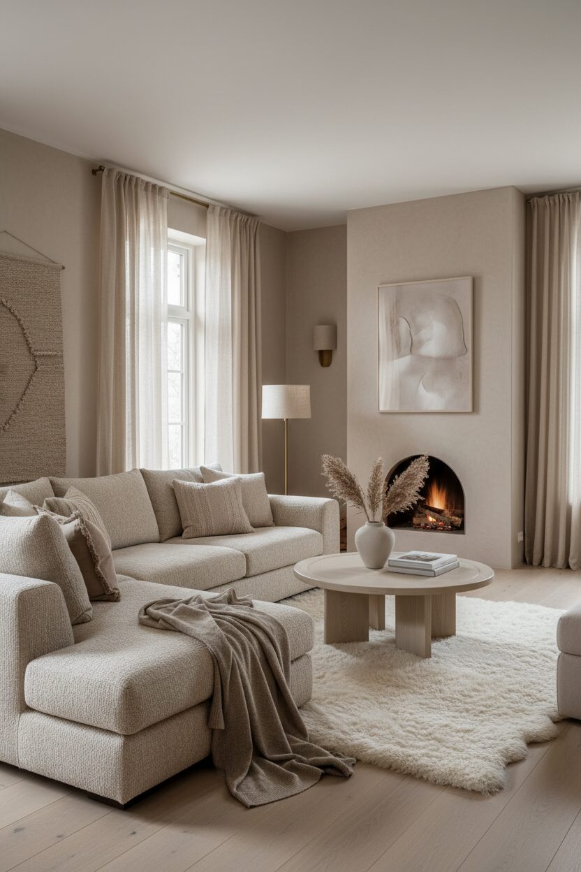
Warm oat beige serves as the primary driver for creating a sense of hygge in modern Scandi homes. This creamy neutral adds a layer of comfort that cooler grays lack making the living room feel inviting and cozy during winter months. It is perfectly suited for large scale architectural features such as stone fireplaces or plastered walls where the subtle texture can catch the light. By layering various shades of beige through textiles like cashmere throws and bouclé chairs designers can create a rich sensory experience. This palette encourages a slow paced lifestyle by providing a gentle background for life.
Dusty Rose Pink for Modern Sophistication
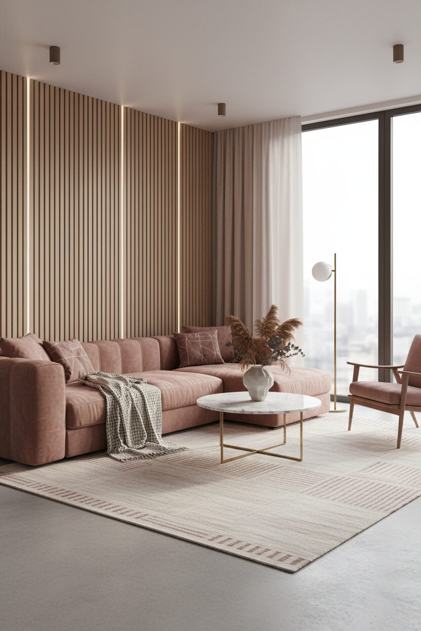
Dusty rose pink offers a sophisticated twist on the traditional Scandinavian color scheme by introducing a muted hint of warmth. This shade is far from sugary as it contains gray undertones that allow it to blend seamlessly with natural wood and concrete. It is often used to highlight sculptural furniture pieces or as a soft backdrop in a reading nook. The color reacts beautifully to warm artificial lighting and creates a glowing ambiance as evening approaches. When applied strategically this pink hue breaks the monotony of neutrals without overwhelming the senses and maintains a very clean and balanced visual aesthetic.
Midnight Sky Blue for Dramatic Contrast
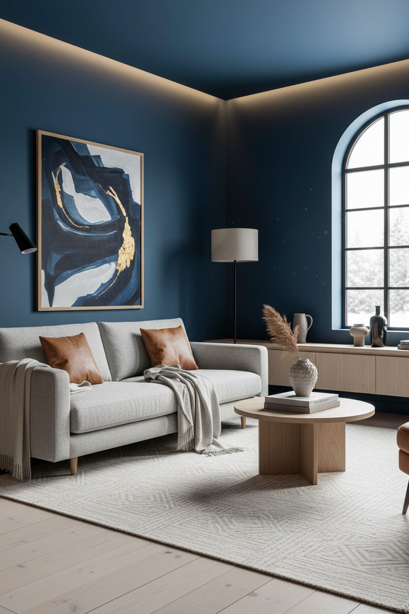
Midnight sky blue brings a dramatic and moody element to the modern living room providing a bold contrast to light surroundings. This deep saturated color is best utilized on a singular focal point such as a built in bookshelf or a velvet statement armchair. It draws the eye and provides a sense of luxury that elevates the overall design. Architects might use this color to define the verticality of a room by painting high walls or alcoves. The dark blue tone pairs elegantly with gold or brass accents and provides a stunning backdrop for minimalist art and monochromatic photography displays.
Terracotta Clay for Artisanal Textures
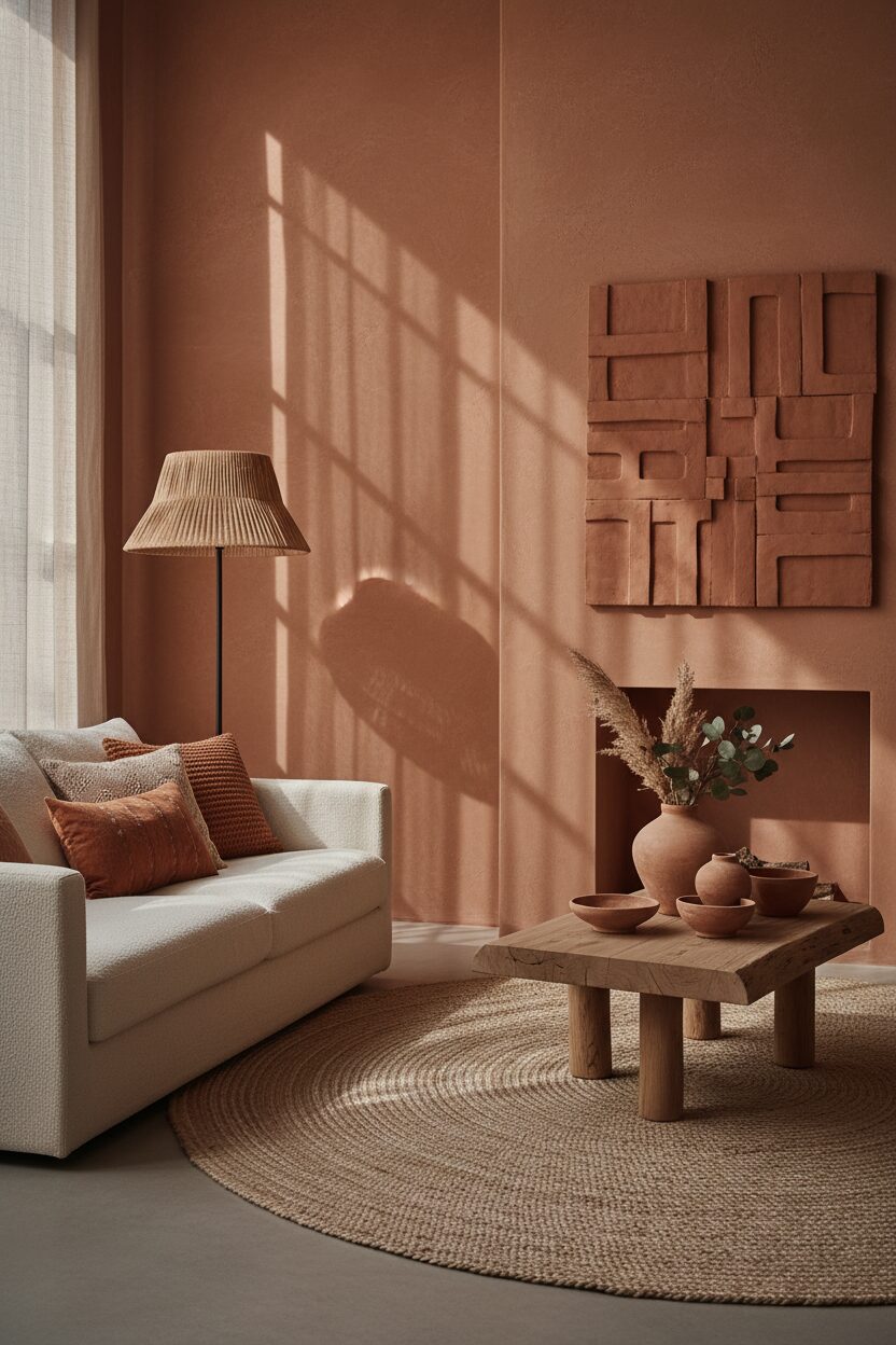
Terracotta clay introduces an earthy warmth that reflects a growing interest in artisanal craft and natural materials within the Scandi style. This reddish brown hue works perfectly with clay tiles or exposed brickwork to add a rustic charm to the space. It acts as a bridge between traditional ceramics and modern interior architecture by offering a rich pigment that feels timeless. Designers often incorporate this color through smaller decorative objects like vases or lamp bases to create spots of interest. The warmth of terracotta balances the cooler tones of glass and steel and ensures a grounded and cozy living environment.
Pale Mustard Yellow for Optimistic Energy
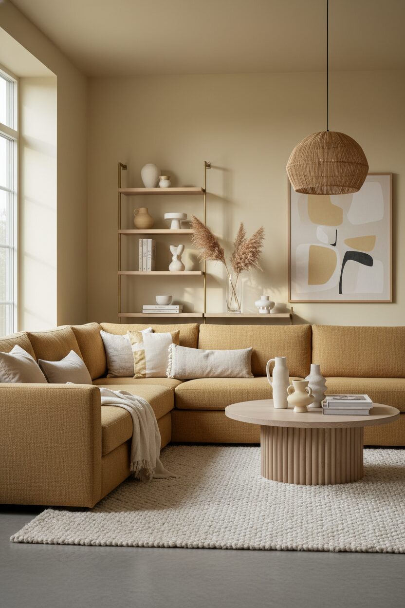
Pale mustard yellow provides a subtle burst of energy and optimism that livens up the neutral Scandi palette for twenty twenty six. This muted yellow is inspired by late summer meadows and adds a cheerful yet sophisticated touch to the living room. It works best when used on textile accents like throw pillows or small upholstered ottomans where it can catch the eye. The color complements natural wood grains perfectly and enhances the warmth of timber flooring. By using this shade sparingly homeowners can inject personality and vibrance into their home while maintaining the core principles of simplicity and functional design.
Leave a Reply