Japandi design represents the perfect marriage between Japanese minimalism and Scandinavian functionality which creates a serene atmosphere ideal for resting areas. This aesthetic prioritizes clean lines and natural materials to foster a sense of tranquility within the modern home environment. By blending the rustic warmth of Nordic hygge with the refined elegance of wabi sabi principles you can transform your bedroom into a peaceful sanctuary. Choosing the right color palette is essential for achieving this balanced look as it sets the foundation for your daily relaxation. Explore these eight trending hues to define your space with sophistication and total calm.
Soft Oatmeal and Natural Linens
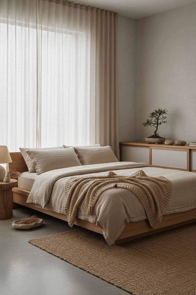
Soft oatmeal serves as a versatile foundation that bridges the gap between warm beige and cool stone. This subtle hue works beautifully on plastered walls providing a tactile quality that interacts with soft morning light. To enhance the architectural depth you should pair these walls with low profile bed frames made from light oak or ash wood. Incorporating natural linen bedding in a matching tone creates a cohesive monochromatic look that emphasizes texture over bold patterns. This spatial arrangement promotes a clutter free environment where the eyes can rest. Soft oatmeal remains a timeless choice for those seeking refined organic style.
Muted Sage for Botanical Serenity
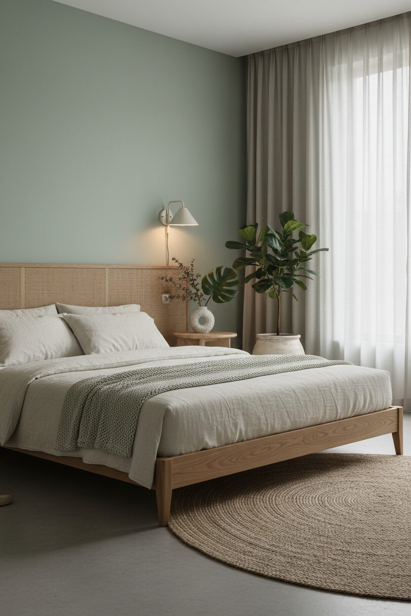
Muted sage green introduces a gentle connection to the natural world without overwhelming the minimalist bedroom architecture. This color works exceptionally well when applied to a primary accent wall behind a slatted timber headboard. The green undertones evoke a forest canopy feel which is further enhanced by soft recessed lighting that mimics dappled sunshine. You can integrate this hue through matte ceramic vases or textured wool throws draped over the bed. Sage green provides a soothing psychological effect that lowers stress levels. Balancing this earthy tone with pale wooden floors ensures the room retains an airy and very expansive feeling.
Warm Charcoal for Sophisticated Depth

Warm charcoal offers a bold yet grounded approach to the Japandi bedroom by providing a striking contrast against lighter wooden elements. Utilizing this deep shade on window frames or structural beams highlights the architectural integrity of the room. When paired with soft diffused lighting this color creates an intimate cocooning effect that is perfect for late night relaxation. Darker tones should be used strategically on tactile surfaces like velvet pillows or heavy cotton curtains to add weight. This color theory emphasizes the beauty of shadows and depth within a space. Charcoal effectively anchors the room while maintaining a modern edge.
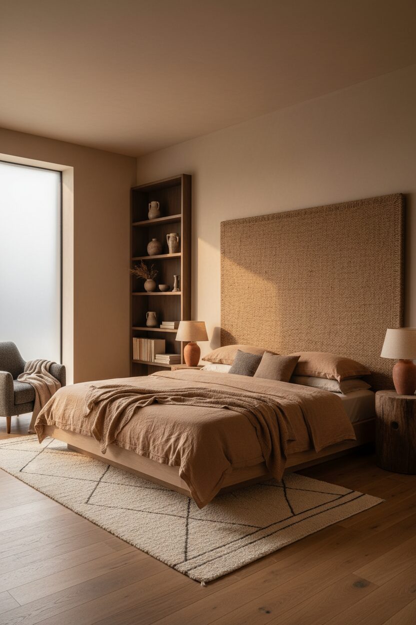
Terrazzo Sand for Earthy Texture

Terrazzo sand is a warm grainy neutral that mimics the appearance of sun drenched desert dunes. This color is ideal for large floor rugs or wall treatments that require a sense of movement and grain. The warmth of the sand tone complements the cooler aspects of Scandinavian furniture while nodding to the earthen pottery found in Japanese design. Lighting should be warm and indirect to bring out the subtle golden flecks within the paint or fabric. This choice creates a cozy envelope that feels both grounding and luxurious. Sand tones provide a rich backdrop for sculptural lighting fixtures and plants.
Dusty Rose for a Gentle Glow
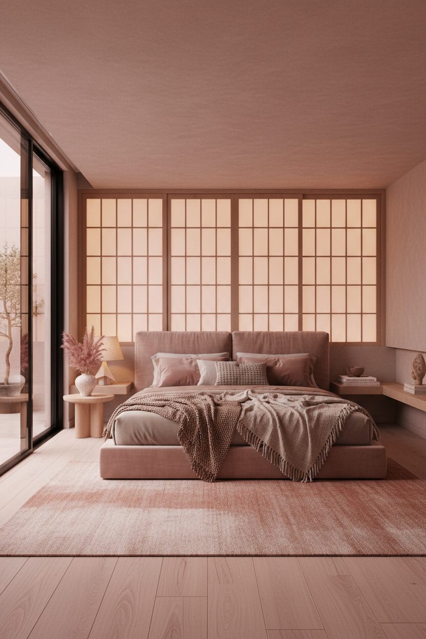
Dusty rose brings a soft sophisticated touch of femininity to the otherwise masculine lines of Japandi architecture. This muted pink shade works best when applied to soft goods such as silk pillowcases or sheer window treatments. The color reacts beautifully with natural light to create a healthy warm glow throughout the space during the golden hour. To keep the look professional you should pair dusty rose with cool grey accents and black metal hardware. This combination prevents the room from feeling overly sweet. Instead it creates a balanced atmosphere of elegance. Rose tones add warmth without ever sacrificing the aesthetic.
Slate Blue for Nordic Coolness

Slate blue introduces a crisp and refreshing element that pays homage to the coastal landscapes of Northern Europe. This cool tone is particularly effective in south facing bedrooms where the sunlight can be quite intense. By applying slate blue to custom cabinetry or built in shelving you create a functional focal point that feels calm and organized. The blue hues harmonize perfectly with light maple wood and white ceramic decor. Using this color in varied saturations adds visual interest without disrupting the peaceful flow of the room. Slate blue is the ultimate choice for a focused modern environment today now.
Toasted Almond for Rich Warmth
Toasted almond is a medium toned brown that offers more saturation than standard beige while remaining firmly in the neutral family. This color is excellent for upholstered headboards or heavy drapery that provides acoustic insulation. The richness of almond tones adds a layer of luxury and comfort that is central to the concept of hygge. When combined with minimalist Japanese furniture the result is a space that feels curated and intentional. Use brass or bronze lighting fixtures to highlight the warm undertones of this shade. Toasted almond provides a stable and welcoming base for any modern Japandi bedroom layout today.
Chalky White for Pure Minimalism
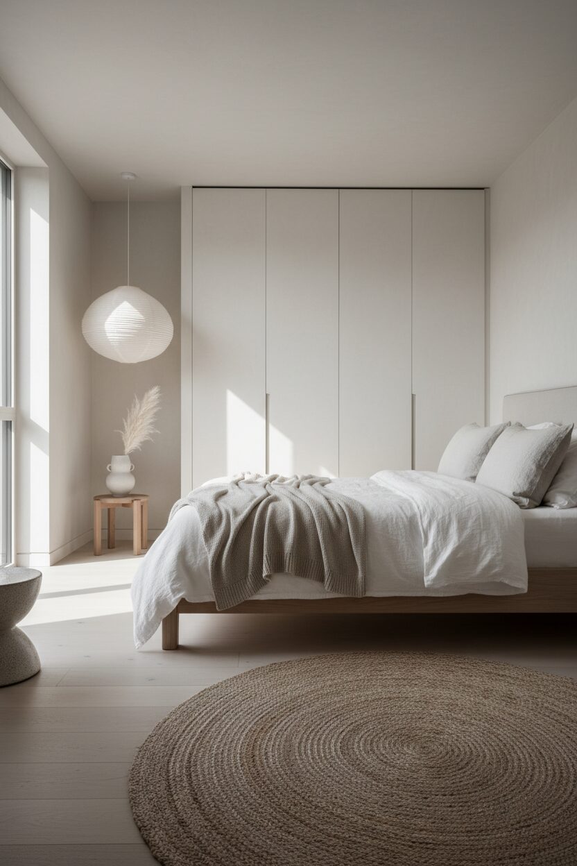
Chalky white is the quintessential Japandi color that maximizes light and enhances the perception of space within a room. Unlike clinical whites this version has a soft matte finish that feels approachable and organic. It serves as a blank canvas that allows architectural shadows and natural wood grains to take center stage. This color is best used on ceiling surfaces and main walls to create an expansive sky like feeling. Complementing chalky white with black accents creates a graphic look that is both sharp and serene. This final color choice ensures the bedroom feels open airy and incredibly peaceful now.
Leave a Reply